Design

Book review: Design Is a Job

design is a job and mike monteiro is GREAT at his job There are all kinds of myths surrounding the arts, especially where they intersect with commerce. Myths about working when the muse strikes, as opposed to working to increase the odds that she will. Myths about success ("It's a mysterious mystery come by mysteriously...plus Twitter!"). Enough myths about money to keep the stick-shaking brigade busy for a thousand billing cycles.

But after almost 30 years of circulation in the worlds of copywriting, performance, and design, I believe the most pernicious myth of all is that artists cannot learn to be good business people. Because we absolutely can if: (a) we're willing to make what may be some uncomfortable changes to our outlook and operating style; and (b) we find the right conduit for the information on how to do it.

When you're ready to embrace that first condition, Design Is a Job brilliantly provides the how-to. Written by Mule Design principal and co-founder Mike Monteiro, it contains a no-bullsh*t framework for building a successful creative business, covering everything from what design is (hint: not decoration) to how to keep your pipeline full of the kind of jobs you actually look forward to working on (hint: it does not involve cold calling, begging, or excessive retweeting). Networking, contracts, presenting, and management—it's all in here, in a compulsively readable 130 pages. Because no one knows better than Mike Monteiro that the real secret to getting the job done is doing the job, not reading about it.

While it is specifically written for designers, like The Elements of Content Strategy, a similarly outstanding entry in A Book Apart's series of "brief books for people who design websites," it is absolutely civilian-friendly.* If you're a creative artist who needs to get paid for your creative artistry, there's something here for you—writers, illustrators, and yes, even you, my lovely actors. You may have to put on your translator headphones here and there, but I guarantee that if you do, you will come away with invaluable insight in how to be less of a goofy creative and more of a goofy creative who gets paid.

Few things are more wonderful than being paid to do work you'd do for free—and few things will grind you down to a grim nub of misery faster than failing to treat that work as a job. Design Is a Job clearly, simply, and often hilariously outlines the steps for actually making a profit doing the work you love.

xxx c

*UPDATE: And lo, A Book Apart feels similarly about the synergy between these two books: you can buy them in a bundle!

Book design by Jason Santa Maria.  Author photo by Ryan Carver.

Book review: Design It Yourself

bizcard_yuichirock

Even though the official Saluteâ„¢ is over, with six bags of books ready to go to the used book store on my next trip out that way, I thought it might be interesting to take a look at some of the titles that made the cut.

I've pulled D.I.Y.: Design It Yourself from the shelf on the last five purges, but I've never been able to let it go.

An exceptionally well-thought out and equally well-produced book, Design It Yourself is crammed (in the prettiest possible way) full of ideas and information about conceiving and executing design projects of all kinds, from logos to photo albums to websites. It seems targeted to what I'd call the ambitious beginner, these aren't particularly scary projects, and there are ideas that range from super-simple to pretty advanced, but all of them require a kind of roll-up-your-sleeves attitude towards making your own stuff, and assume a level of lively interest in the mechanics and principles of good design.

Or, to put it another way, you could start with any particular project, a business card or a t-shirt, a press kit or printed book, and start to develop a fundamental understanding of the way things work, design-wise. The editor, Ellen Lupton, and the many contributors (all grads from the MFA program at Maryland Institute of Art) don't want to just walk you through how to put together a newsletter or roll your own notecards; they'd like you to see the beauty in thinking of things from a design standpoint, how they work, and why they work better when you take a thoughtful, holistic view of things.

The best way to do that is to demystify what they can, which they do in excellent overviews of design theory, branding and the DIY ethos, and then to make it all look incredibly sexy and fun. Which, I'm here to say, it is. Once you get your hands a little dirty with this stuff, you get sort of addicted to it.

Even if you decide you'd rather turn certain jobs over to the pros, the pictures, projects and stories will inspire you to open up and embrace your creative side a little more readily. Plus I'm fairly sure they'll make you a much better client, it's always easier to get good work out of someone when you have respect for what they do, and some understanding of how to evaluate and participate in the process.

Bottom line: if you're looking to get a few ideas for the big gifting season coming up hard upon us, or a little smarter about how to look at design in general, Do It Yourself is a fine place to start. And definitely, a fun one.

xxx
c

Image by yuichirock via Flickr, used under a Creative Commons license.

Nerd Love, Day 7: I {heart} Edward Tufte

tufte books When normal people play hooky, they go to the movies or the beach or Vegas.

When nerds take the day off, they go to see this guy, and come home 8 hours later, drunk with possibility, clutching a set of books so beautiful in both thought and execution, you get a little dizzy just opening one up.

I took a ton of notes, which I'll share with the class at a later date, but the topline is this:

Edward Tufte really is "the Leonardo da Vinci of information" (New York Times quote, not mine), and seeing him in person really is worth every penny of the not inconsiderable sum it costs to do so.

You get all of his books, he's up to four, which are impossibly priced at the low, low figure of $40 apiece. I say "low, low" because from the little I know about book production, there's no way you could print these conventionally for that price. (Tufte has his own publishing company, Graphics Press.) They are exquisitely produced works of art so full of wonderful information it will take me months, nay, years to absorb it all. And if you go to the lecture, he uses them as the support material! Makes those crappy PowerPoint leave-behinds looks pretty lame. Which is, of course, the entire point.

Edward Tufte is not as anti-PowerPoint as even he says he is.

The essay that put Tufte on the map with the hoi polloi (he'd been rockstar-popular with the geniuses for far longer) was, predictably enough, the one where he tells everyone's favorite meeting crutch where to get off.

He hates PowerPoint, to be sure, but he was careful to qualify his hatred:

  1. ET says that PowerPoint does not ensure sloppy thinking, it just makes it more likely
  2. ET reserves the bulk of his wrath for those who misapply PowerPoint in "serious" presentations, people who are cutting off feet to fit bodies in beds, either unintentionally (well-meaning scientists who abandon their language of notation and explanation to fit PowerPoint's low-resolution, limited character set world) or intentionally (evil people obfuscating or outright fudging data with visual double-speak, and he hates those people no matter what medium they're using towards their nefarious ends)

If you wanna do a PowerPoint about kitties, I don't think ET is gonna have a problem with it. PowerPoint as infotainment is relatively benign. So my work as a presentation designer is not moral compromise, provided NASA or the Federal Reserve don't engage my services. As if.

Watching Edward Tufte is an exercise in head-exploding newness and, simultaneously, a joyous feeling of coming home.

My brain is still reeling from playing catch-up with some of the finer technical points, but the rest of my body is still vibrating with the shock of recognition. Over and over in my notes, I have little asides with stars and underscores where I realized his points were essentially the credos I've been living with for the past 10 years or so: "Tell the Truth" and "Form Follow Function" and, less pithily, "Figure Out How to Say It So People Will Get It, Asshole."

It's the content, stupid.

'Nuff said.

Now, back to the business of delivering information in an elegant, useful fashion...

xxx c

For those of you who are unfamiliar with the work of Edward Tufte, here are some good places to start:

  • Edward Tufte's website (link)
  • Salon review of Tufte's book, Visual Explanations (link)
  • Jason Carr's notes on a Tufte speech several years ago (link)
  • A brief post by a software engineer on Tufte's relevance in new media (link)
  • Wikipedia entry (link)

Image by unertlkm via Flickr, used under a Creative Commons license

New design/portfolio site up!

communicatrix DESIGNS logoWell, a mere five months later, we have launch! With the able coding assistance of master (or is that 'meister'?) programmer, Michael Grosch, my new friend from Germany (by way of Austin, TX and SXSW), I've finally got the communicatrix | designs site up and running.

It's brand new, so there may be a missing link or two, but overall, I couldn't be happier with the results. Please do drop by and take a peek...and if you would, drop back here and let me know what you think.

Next up? The communicatrix | presents site, along with a complete overhaul (or at least, a serious retooling) of my presentation design portfolio. Four days at Son of NerdFest (a.k.a. PowerPoint Live 2006) and the underwhelmed reaction of one of the rockstars in the presentation design business made it painfully clear that I've gotten waaaaay too lazy about keeping my output updated.

But that's an electronic story for another day...

xxx c

LINK: communicatrix | designs

Extensis® can kiss my Arsis

Here's one thing I learned pretty quickly in my capacity as self-taught designer: fonts suck. I mean, fonts RULE, they totally FUCKING rule, but they are delicate and unwieldy and fuck with your OS* like you wouldn't believe. For years, seven of 'em, as long as I've been doing this design stuff, I've suffered in silence (HA!) as my system froze, crashed, hung or otherwise made my life a living heck because of fucking font problems. For those same years, I've shelled out good money for font management software to try to lessen the pain of dealing with fucking font problems. (Of course, if I moved to web-based design instead of print, 99% of my font issues would vanish instantly, but hell, I can hardly be expected to give up the glamor that is low-end, gang-run print for the pedestrian world of web publishing. No...that would be too EASY.)

This weekend, I broke down and bought FontAgent Pro. Let me repeat that, and maybe scribble it in a notebook with "Mrs." and my name before it like a silly schoolgirl in love, FONT AGENT PRO!

As we say in SoCal, Dude...duuuuuuude!!!

It auto-activates in every goddam program, including Photoshop. It stays in the background until it's needed, instead of launching at startup and lurking on the desktop, causing trouble. Fonts launch in MILLISECONDS, I tell you, MILLISECONDS, instead of the minutes it was starting to take in That Other Font Management Program. There's a genius font-comparison panel built into the program's main window where you can line 'em up with your own sample text (fucking DUH!!!!)

And best of all, my OS has not hung, crashed or frozen once this weekend since installation. Not. Once.

So FUCK YOU, Extensis. And just so all the search engines can find it:

REASONS TO BUY FONT AGENT PRO and NOT Extensis Suitcase:

  1. FontAgent Pro compared to Suitcase KICKS ASS!!!
  2. Suitcase IS ass!!!
  3. FontAgent Pro is the only font managment software you should buy and is worth every bit of 99 bucks and finally, because from personal experience I know that this will show up in more searches than anything else I could ever write...
  4. FontAgent Pro. AND giant labia AND colorectal singalong AND Jane Kaczmerek naked.

Nyah nyah nyah.

(Sorry, Jane.)

Peace, out.

xxx c

Above graphics use Arsis, launched with FontAgent Pro, and lovingly crafted in Photoshop, which did NOT fucking crash during use due to evil Extensis Suitcase.

*OS = "operating system", in case you are even less geeky than me

TAGS: , ,

Best of the flyer table, II

Much as the Avid changed editing both for better and for much, much worse (back in my ad days, we called it "the version machine"), desktop publishing has forever altered the messy terrain that is the 99-seat theater's lobby flyer table. Why use a boring old photo when you can add FIVE FILTERS in Photoshop...for FREE? Why use one or two fonts to tell your story when you can get all the fonts you want on the web...for FREE?!?

In fact, why worry about creating your own image at all, just lift some JPEG off the web, rez it up and call it a day? (Okay, okay, I'll admit it, I've been I'm guilty of this one.)

The striking, solo image, simple, evocative, and laid out with taste and restraint, is getting harder and harder to find. Which is why, I guess, when I do find one, it's so striking.

The Center Theater Group's gorgeous flyer for Electricidad reminds me of the excellent images created by legendary illustrator/designer, Paul Davis. (Good WNYC interview with Davis here, where he also laments the piss-poor state of theater graphics.) John M. Valadez did the extraordinary illustration, and the designer knew enough to let it speak for itself. Great concept, beautiful execution.

Similarly, I really liked the piece for Ken Roht's Echo's Hammer, now playing at the Boston Court in Pasadena. At first I was miffed when I saw the flyer on the table: Ken is a good friend of mine, and for years, has come to me when he needs a flyer designed. In fact, in addition to being directly responsible for my pursuit of acting as art, it was Ken who got me started on the road to print design, some seven-odd years ago. (And I've heard similar stories of artistic awakening at the hand of Ken Roht from a number of people. I guess that kind of faith is to be expected from a choreographer who hires non-singing non-dancers to populate his kick-ass musicals, but still, it never ceases to amaze me.)

The illustration for Echo's Hammer by Iona Egg is simple and beautiful, and the piece itself was beautifully produced (crappy Internet rendering does it no justice, believe me). The nature of Ken's shows is very much the whole being greater than the sum of its already excellent parts; what I like about the illustration the designer chose for the show is that it isn't just a Photoshop collage of all the representative facets of the show, the art couple, the regular couple, the gigantic sculpture that's built over the course of the play, but one, simple, elegant image.

Sometimes, though, it's hard to find that image. Really, really hard. I don't usually throw down my own work as a good example of anything (except maybe the extraordinary open-mindedness of my clients), but I'm actually proud of my recent design for The Blacks and thought it might be interesting to examine why.

Typically, I'm under the gun with my designs for the Evidence Room. There are a few reasons for that: we usually choose our plays one at a time, which doesn't leave much time to let the ideas bubble up slowly from my deep, messy consciousness; also, I'm spread way too thin and free work (alas) usually ends up taking a way-back seat to commercial work and paid design work.

But we knew we were doing this production of the famous Jean Genet play last year; indeed, I'd been a part of two readings of The Blacks for director Lee Richardson starting two-and-a-half years ago (if the Crohn's wasn't a part of my life, I might even be in this particular show, but alas, the physical demands of this kind of ensemble work are too great for me nowadays). So obviously, I'd had Blacks on the brain for awhile.

Still, the image eluded me. It's a big, sprawling play with big, sprawling themes, including racism and class-ism, which make me distinctly uncomfortable (which, in turn, is exactly why we should be doing this play). But the tenor of the play is pretty gonzo: Jean Genet subtitled it "A Clown Show," after all, and rightly so.

I kept having this vague idea of an all-type treatment, but I wasn't completely sure whether it was because the idea of pickanninny art (that's "Black Americana" to you, boss) made my whitey-white skin crawl or because it was the right tool for the job. But other ideas started floating in, vaudeville and placard, specifically, and the capper came when my usual cohort in design crime at the theater also tossed out the idea of an all-type treatment. And when I mentioned the turn-of-the-century poster idea and he actually had a book in his possession with samples of just such a thing, well, it was Kismet.

Or The Blacks.

Which you should come to see, by the way. Because in the same way that true daring in design is often using less instead of more, addressing a simple, scary idea in theater can make for some gripping fucking drama.

xxx c

THE BLACKS opens May 21 at the Evidence Room 2220 Beverly Blvd (at Alvarado) Los Angeles, CA 90057 Tickets on sale now: (213) 381-7118 evidenceroom.com

Do do that voodoo that you do so well

fioreI always thought auditions were horseshit. Let me clarify: I knew they were (a) necessary (evil), but I found it maddening the way people on both sides of the camera looked at them as a one-way proposition, with the power flowing from the producer end to the (ahem) "talent" end. Because frankly, that was horseshit. Too often, and I know this because I was guilty of it myself as a copywriter, auditions are used to figure out how a commercial works...or doesn't. What is or isn't funny about the script/premise/action. And sometimes, horror upon horrors, auditions are actually used as a means for old ad chums to get back in touch with me.*

And then there's the whole pathetic actor-y side of auditions, the Just tell me what you're looking for/I can play that, gambit, which is a bigger, steamier and infinitely more treacherous pile of horseshit. I am fairly certain there are street people wandering around Los Angeles right now who were driven over the edge trying to discern that elusive whatsis that the producer/director/whoever wanted. Which was usually just to be anywhere but in a room that smelled like feet, stuffed full of M&Ms and bad deli.

At some point in my checkered career as an actor, I began hearing people, teachers, casting directors, random passersby, pay lip service to the notion of using the audition to show what you could do rather than what they'd asked for. As someone who grew up being handsomely rewarded for coloring within the lines**, I immediately recognized this as yet another manifestation of horse pokey, and happily freed up precious gray cells for important things like remembering my own phone number and what I'd paid for a particular shirt back in 1977.

Fast forward to...this weekend. I was working on a design job for an actress putting up a one-person show. They'd delivered a full-on, finished photo for me to work with, which is usually nice, all I have to do is figure out the font thing and bing-bam-boom, we're off to the races.

But every time I sat down to apply type, I got this funny feeling that something wasn't right. That even though I'd been given a complete image, the show, with its suggestive title and goofy provenance (the actress is an Ivy-educated woman who's done time on MAD TV), needed something else. Which is, of course, craaaaaazy thinking. And yet...

I messed around. I shredded the image, blew it up so the client's (very pretty) head was out of frame, stripped it of color and instead saturated the card with garish printer's inks. And I sent it off, knowing full well it was nuts, I mean, the client's HEAD was cut out of the frame...and she's a BEAUTIFUL ACTRESS, but also that, nuts or not, it was what I had to offer the show.

There was a little, um, back & forth. Wanting to see the head. (Visionless ingrates!) Wanting her name to be legible. (Bourgeois killjoys!) I could have succumbed or I could have pitched a fit. Actually, I did both, quietly, in succession, at my desk, before making what changes I could. I sent off several of the very-next-best things that really weren't nearly as cool, but hell, if I want to be an artist, I should get out of the postcard game.

And then, a miracle. The actress wrote back saying that I was right, that my original vision was the way to go. And thanking me for all the work.

If I could, I'd comp the job. It was gratifying having someone respect my ideas, yes, but more than that, it was such a great, simple lesson of the essential rightness in doing what it is that you do, regardless of what conventional wisdom says. I might not have gotten "my" way with the card. I definitely am not always going to book an individual job, even if I knock it out of the park doing what it is that I do. Sometimes, you're just a cruller living in an onion bagel's world. But I keep my integrity, my compass and my identity (hey, next time maybe they'll want a small, sullen bitch...er...pastry).

So thank you, Kathryn Fiore, my newest teacher***. And long may you run...

xxx c

*Note to old ad chums: if you want to say "hi", contact me via my agent, invite me out for a drink at Shutters on your expense account or send me a goddamn e-mail. Do not drag my hide all the way across town on a call I'm clearly not right for so you can say, "Remember me!?! We used to work together at [former agency long since swallowed up by Publicis, Saatchi or other media megacorp]!!! Because I will be remembering your sorry ass all the way home in traffic on the 10 and then I will remember it for posterity on this blog. You have been warned...

**I worked in creative, yes, but mostly packaged goods, not the sexy stuff. You do not work your way up the ladder by writing breakthrough advertising for BirdsEye and Jell-O Gelatin.

***And I do mean newest, girlfriend was born the month before I started college. Oy, am I old...

Link to large size of the graphic here.

Link to more of my theatrical flyers here.

Wake up! To a year of GOOD DESIGN!!!

Is this the year of the Rooster or the year of the Designer? Maybe it's both! All I know is I've got to be up when the rooster crows to keep up with all the design projects streaming through my in-box these days. And the money! Why, I may have to employ extra help just to count it all! Anyway, while it's really fun (really! it is!) working on cool-i-o stuff, I recognize the process can be a little daunting for those just getting their feet wet in the design world.

So, in keeping with The Communicatrix Goal of offering Useful Tips for Living and other valuable nuggets, here are a handful of tips to get you started on the road to graphic happiness:

1. When you find a new designer via the web, always ask for a detailed estimate. If you don't like it, you can always just ignore it. And don't be intimidated by pressure tactics like them "following up" with a "polite" email. After all, who's the customer, here? That's right, you!

2. Remember, a more complicated job requires more lead time. For example, while a business card should take no more than an hour or two, you should probably allow at least a day's turnaround for your company newsletter. Haste makes waste!

3. If you have ideas, be sure to share them with your designer before he or she starts working. Comments like "I think Comic Sans would be a great typeface to use for the body copy, don't you?" or "I like a heavy drop shadow on my headlines" not only are great thought-starters, they show your designer that you're not some rube who just fell off the design turnip truck!

4. By the same token, if a brain flash hits you at the last minute, by all means, don't hold back! A good designer won't be mad that you're changing everything at the last minute, they'll be thrilled that you care enough to make them look good!

5. Another way to be helpful is to give your designer lots and lots of fun clip art to use. TIP: When it comes to clip art, there's no such thing as too kooky! Don't worry if it looks a little jumble-y; matchy-matchy is out,  eclectic is in!

6. Don't let some hoity-toity graphic "designer" tell you how many typefaces is too many! If God didn't want us have a lot of fonts in our printed material, why would he have put so many on our computers? Stupid designers!

7. To make your newsletter stand out from the pack, try copying it onto colored stock. TIP: Different colors can change the mood completely: for a “serious” look, try mint green; for a fun, fruity look, how about grape? And nothing shouts "I Am Acme Widgets!" like a ream of Astrobrights: hot pink, neon orange, rock'em-sock'em lime, etc.

8. Graphic designers like to throw around big, confusing terms like "white space" and "that colored stock you copied the last newsletter on makes it a little hard to read" just to make themselves feel smart. Don't be fooled by fancy double-talk. If your newsletter was hard to read, your family would have told you!

9. If there's anything you don't like about the design, don't hurt your designer's feelings. Just ask for an "output" and once you get it home, cut, rearrange and paste to your own liking. Then just Xerox and, voila! you're a graphic designer! (TIP: If you copy it at extra light, the cut lines barely show at all.)

10. Finally, don't feel like you have to hire a designer just because other people are doing it. After all, if you own a computer with Microsoft Word and hands, you already have all the tools you need to produce fine graphic "design" in the comfort and privacy of your own home, and save wasted money, too!

Enjoy!

xxx c

Best of the flyer table

flyertable
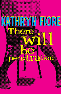
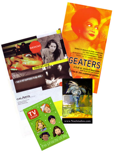
One of my continual frustrations as a theater rat with a scrabbly foot in the design world is the unforgivable lack of pretty in most show flyers. They'll pay the lighting designer, they'll pay the costume designer, they'll sure as shit pay the director, they'll get everything on stage looking Sunday-go-to-meetin' purty, and then crap all over themselves with an ill-conceived, poorly designed flyer. It's like my crazy Polish art teacher whined about back in silkscreen class: the packaging on materials being sold to artists is among the dullest and horsiest design there is. Ah, sweet irony. (Of course, I say this knowing full well that our website is among the ugliest in town, but I'm not web-proficient enough to do anything about that end of the design thing. So there.) [UPDATE 10/9/07: our beautiful new site, designed by me and developed by Jen Rocha, is available for viewing here.]

Anyway, out of the (no lie) 25+ (!!!) flyers on Evidence Room's box office entry table, above left are the few I found that I wish I'd done myself. Designers, feel free to step forward and introduce yourselves:

  • REDCAT's tasty season brochure. Yum, yum. Of course, they've got funding out the wazoo and ties to one of the West coast's greatest art communities. They'd be stoned for anything less than stellar design.
  • Jon Rivera's Dogeaters flyer. Great use of oversize medium, color and imagery. Love the crazy low-end Photoshop work on Imelda's eyes, too.
  • For juicy, juicy printing alone, the flyer for Phacts of Life (show running at The L.A. Gay & Lesbian Center's Renberg Theater). Chris Rooney did the design; may have to email him for his printer's digits. The show looks kinda cute, too, and features the always-hilarious Sam Pancake and a stellar roster of guest stars: Mink Stole, Kate Flannery and Mike Hitchcock.
  • Finally, I just plain liked the image on the flyer advertising Todd Noel's work. Not as nuts about the rest of the stuff on his site (and not crazy about the font the Toddster chose for the flyer, either), but it got me to type in a URL and click, which is more than most of those flyer jockeys do.

xxx c

New design portfolio up

mm heart tee olive

I've uploaded a bunch of images to the second "photo album" containing my graphic design work, including some t-shirts I sketched out for Megan Mullally & her band, Supreme Music Program, right here. Link to the first one, exclusively postcards, is here.

Feel free to hire me for all your graphic design needs, especially super-cool ones that pay gobs of cash.

xxx
c

UPDATE 2/26/06: Galleries lost in the move from TypePad. You can find my graphic design for theater on Flickr.